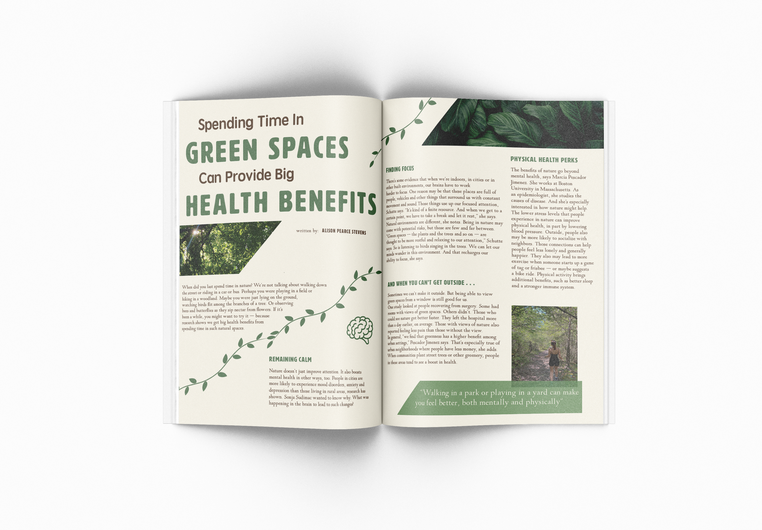
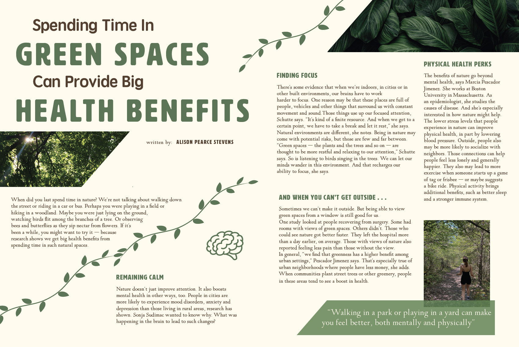
For this project, the goal was to create something calm and relaxing, but still informational. The use of hierarchy was a key aspect of this project to establish a sense of importance. Using different fonts and font weights created a distinguishable hierarchy, along with the change of font color. To create eye movement, decorational elements such as vines were used to bring the eye to the middle of the page. The way the images are cropped also helps lead the eye in. The use of empty space is important, because if the page is too full, it will feel chaotic and stressful to read. The color palette was chosen to give a natural, earthy feel - one that many people would find calming.

